UX Test: Qatar Airways App
Travel
Quick UX Rating on the Qatar Airways App (1 Hour)

In this case study, I demonstrate how quickly I can analyze and ideate around a digital product — the entire process took just one hour. Using the Qatar Airways app as an example, I identified key UX issues and developed practical, user-centered solutions. This fast-paced approach combines critical thinking with creativity, all while keeping the user experience at the core.
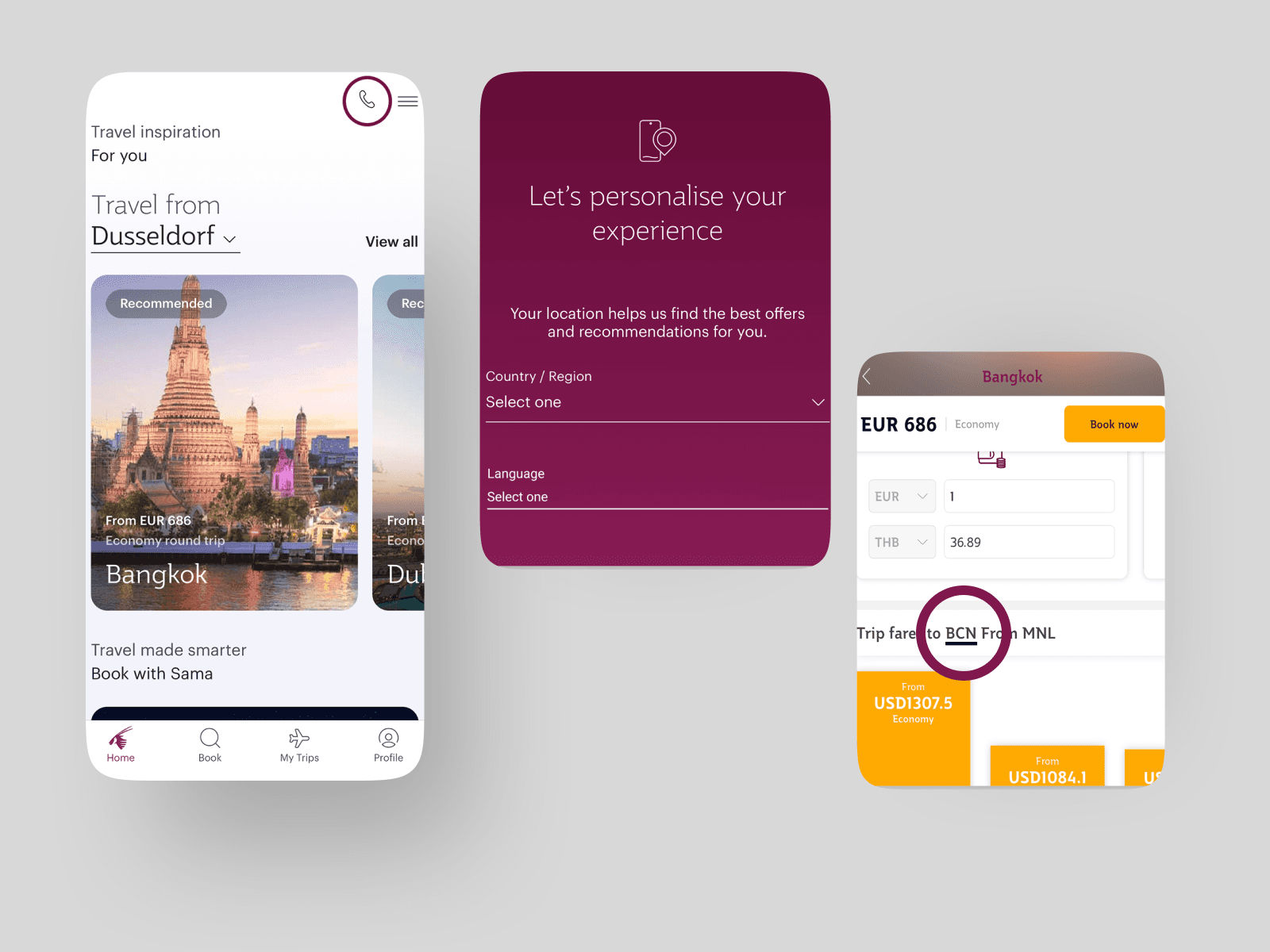
Within just 60 minutes, I tested the Qatar Airways app hands-on, reviewed public user feedback, and mapped out a typical user journey — from exploring destinations to completing a booking. I quickly uncovered several UX pain points: - Inconsistent UI across different areas of the app, breaking the flow - Frames within frames, leading to confusing transitions and lost progress - Missing personalization, such as auto-detecting or selecting a departure location - No clear language settings, making it harder for users in different regions - Lack of quick access to support, especially critical for new or infrequent users - Unhelpful error messages that leave users without clear next steps
Using simple tools like pen & paper and Figma, I sketched low-fidelity concepts that addressed these problems. I focused on intuitive fixes — like adding a language selector, centralizing support, and creating a more unified visual experience — all while working within a very limited timeframe.
This case study highlights not just my UX thinking, but my ability to work fast and efficiently under time pressure. In just one hour, I went from discovery to ideation — identifying real user issues and presenting actionable improvements. For me, great UX design doesn’t always need weeks of research — with the right mindset and sharp focus, even an hour can lead to valuable insights and impact.