Boosting Sales with Smart UX
Automotive
🚀 UX Case Study: kolbenstore.de – Boosting Sales Through Clear Information & Smart UX
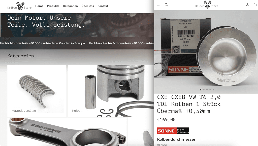
Starting Point Before I stepped in, kolbenstore.de presented products in a highly inconsistent and minimalistic way: Each product featured just a name (usually spread across ~5 inconsistent lines), a price, and a very generic description. Crucial technical details were either missing or not standardized — things like compatibility, exact dimensions, manufacturer part numbers, or what’s included in the box. Surprisingly, there was no customer login, meaning returning customers had to call the already-overwhelmed support team just to reorder.
My Approach: “Understand – Test – Implement” Understand: I researched what B2B and D2C customers (mainly workshop professionals) actually needed to make fast, confident purchase decisions. Test: Built wireframes and prototypes to validate which product attributes were truly relevant to them. Implement: Instead of building fancy UI, I dove straight into Shopify development. Why? Because the pain point wasn’t visual appeal — it was missing information and poor UX.
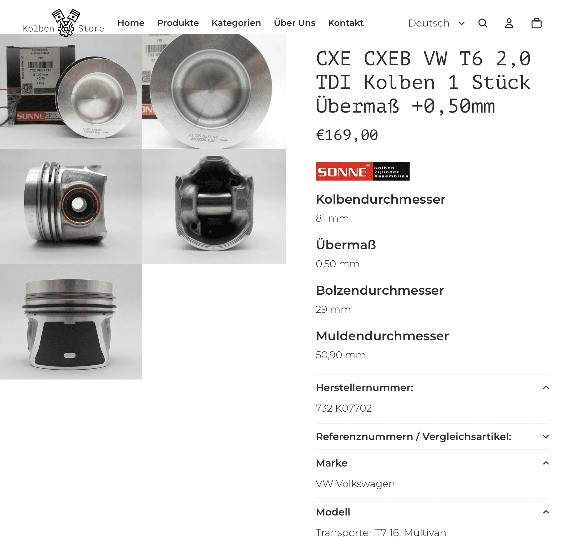
UX Improvements & Key Actions 1. Structured Product Information by Category – I expanded the category system from just 3 to over 15, allowing each product category to display only the attributes relevant to it. – Now, workshop owners can easily identify the right piston or part by compatibility, dimensions, OEM references, and included components. 2. Mobile-First & Performance Optimization – Despite the amount of technical information, the product pages remain easy to navigate on mobile via collapsible sections and clear labeling. – I also optimized loading times and touch usability, creating a much smoother mobile experience. 3. Customer Login & Reorder Feature – I added a login area so returning customers can reorder previous products with just one click — no more phone calls needed. – This reduced pressure on the sales team and improved customer satisfaction and retention.
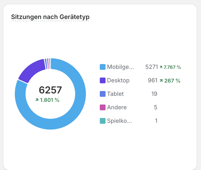
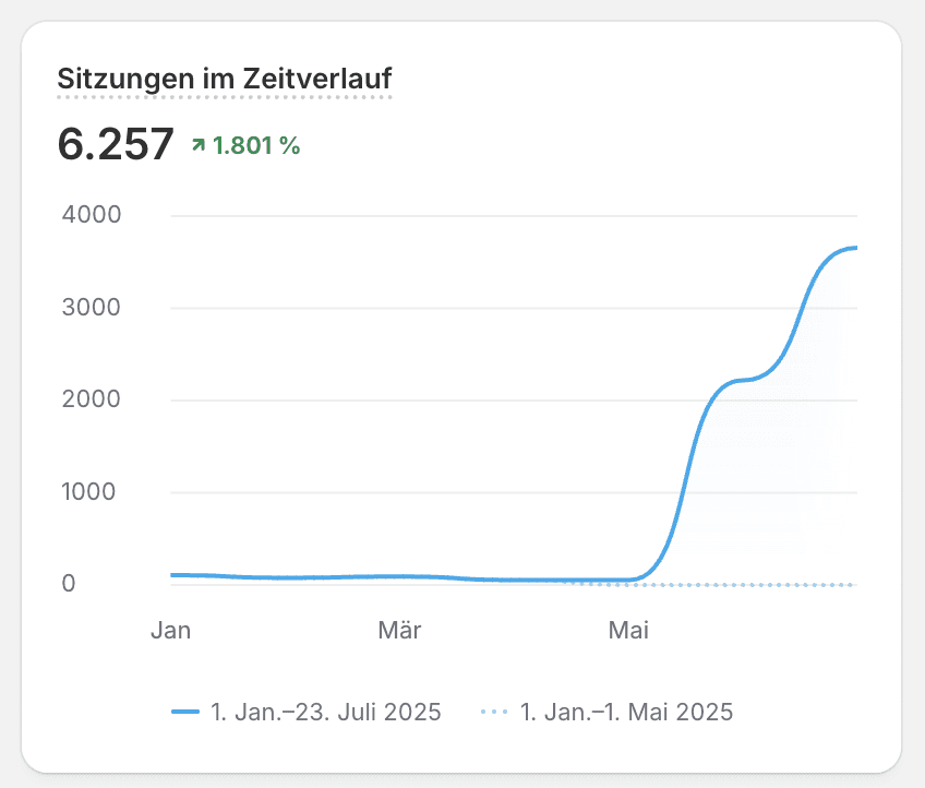
The Results After 2 Months 🚀 Gross revenue: +81% increase Total orders: 75% increase Total sessions: 6,257 → +1,801% increase Mobile sessions: 5,271 (+7,767%) Desktop sessions: 961 (+267%) Tablet & other devices: marginal These numbers clearly show that the redesign not only boosted revenue but also dramatically increased traffic — especially on mobile.
The key was simple: Understand the target user, present relevant information, and build UX-first, not UI-first. In the B2B & D2C space, success comes from clear product data — not flashy images, but answers to real questions like: Does this piston fit my engine? What’s in the box? What’s the exact size and part number? The customer login with 1-click reorder added efficiency for both users and the client’s support team. Lessons Learned "Less is more" — especially when it comes to visual distractions. Mobile-first isn’t optional anymore — especially when your users are mechanics browsing from the workshop. Shopify’s built-in UX works great if you know what your users truly need and keep the development lean.